top of page
project overview
Boba Heaven Redesign
Redesigning the website for startup company Boba Heaven, applying responsive design.
duration ⏳
Ten Weeks
role 👩🏻💻
UX Designer
project type 🖌️
Redesign
tools 🔧
Figma
Zoom
Google Docs
define
problem
Users had an unpleasant experience browsing
There were difficulties regarding readability, navigation, and content placement.
There was missing content, large areas of white space and an advertisement pop up as users switched to each page.
solution
Website Redesign
A more minimalistic feel with clear call to action and UI card design so that users do not feel overwhelmed.
Simplified sitemap so that users can navigate with ease.
research
Interview Objectives
-
Gain an understanding of peoples experiences while navigating through Boba Heaven's website
-
What do people like or dislike on the site and their overall feelings towards the site
-
Determine if people face any challenges while they are on the site
User Interviews
-
I recruited 4 participants to explore Boba heaven's website on both a desktop and mobile phone. I encouraged participants to share their thoughts aloud and asked interview questions as they browsed the site as well
-
All participants have ordered food and drinks online, and participants age range was from 17 to 48 years old
affinity map

Analyzing the why
All users were unhappy with content placement, navigation, an readability. They were overloaded with product options making it difficult to organize their order and it's cost.
Quotes from interviews:
"I thought that I could order online here."
-User 2
😟
"The menu is so overwhelming, I wouldn't know how to customize my order"
-User 4
😓
"I feel lost, not sure how I got to this page"
-User 3
🤔
Examples of frustrations:

ideation
How can we enhance user experience?
-
How can we organize content and information so that users can navigate the site efficiently and not get lost?
-
How can we improve the accessibility and functions needed for users to complete an order online without being prompted to order from another site such as door dash and other online platforms?
-
How can we reduce the amount of information so that the company can communicate its messages to users clearly?
-
How can we create a design aesthetic that would invite users to a friendly environment and keep visiting boba heaven?
Mapping out improvement ideas by each page:

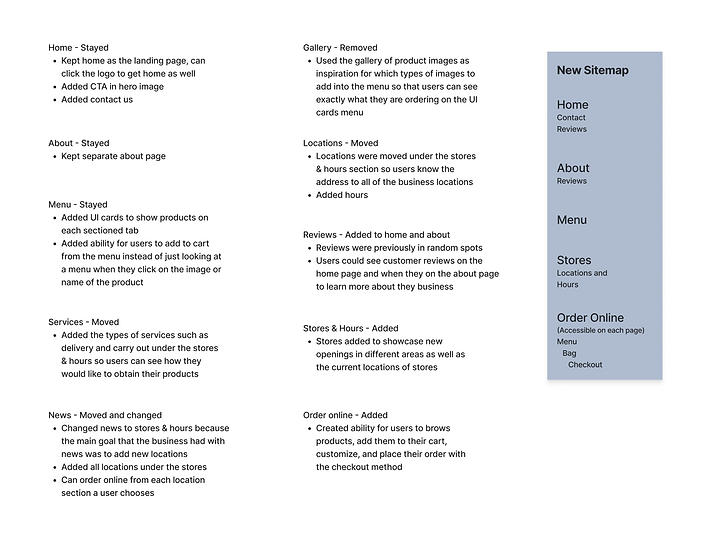
revising the site map
Before redesigning, users who visited the site felt overwhelmed and confused. They did not feel confident navigating the site, and there was no order online capability from the original site.
Users wanted to be able to easily order online from the original boba site and know exactly what they are ordering, the price for each type of product, and the ability to customize their order.
Most users felt like they would like a clear option between carry out and delivery at their checkout process as well, weather they will be driving to the store's address and picking up, or adding their own address for delivery.
Original & revised site maps:

Changes made to pages:
wireframing
Visualizing the solution
During the wireframing process I prioritized implementing solutions for each page stemming from the concerns that users had while browsing. I did this by improving the navigation system, having more clear call to action buttons, designing a more organized menu, and decreasing the amount of white space and blocks of text on the site.

inspiration
Here is an inspiration board that I have used while creating wireframes. Due to there being so many restaurants as well as business displaying products, I was able to find examples for many elements I ended up including in the final design.

usability testing
Positive feedback was provided for the redesign along with iteration suggestions
Users expressed how they wanted to explore the new "organized and inviting" redesigned site.
2
Prototypes
User testing was first done on the mobile prototype, followed by the desktop prototype
4
Flows
Browse menu, customize item, order online and checkout
4
Participants
Users who participated in the interviews were invited for usability testing
Overall users had a much more intuitive experience
did it work?
Results by task:
-
4/4 users used the hero image Call To Action button to browse the companies products and visited each section on the menu. They used the menu bar at the top of the page to switch between sections (mobile & desktop)
-
4/4 users clicked on an item on the menu and were able to understand the pop up, how to use it in order to make specific customizations to their order such as different ingredients, sizes and quantities (mobile & desktop)
-
4/4 users were able to read the summary of their order, see the quantity and price, and recognized where they could edit their specific product or go back to the menu to add more items. All users were able to use the order online method and checkout successfully (mobile & desktop)
iteration
Addressing user feedback
User feedback during usability testing called for adjustments and inspired new designs
Updated menu options and search bar
-
Most users 3/4 did not click on the menu arrow in the initial design to see other selections. This called for updating the design to make sure that most of the options were visible right away for the user rather than having more of the options hidden
-
Users preferred buttons to be pill shaped and I added color to the non selected options along with a clearer drop down for other options instead of a horizontal click option, search was moved up

desktop
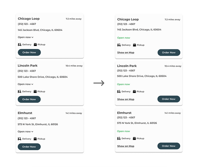
Updated Ui cards for locations
-
2/4 users did not want to use a drop down to see when the specific locations were open but instead liked seeing if they were open or closed right away with color coded words
-
3/4 users also wanted to see specific locations on the map and wanted to be able to do so by clicking straight from the specific location of the card that they chose, rather than only using the search bar
-
I added color to the status of business hours for each location along with a 'show on map' option for each location ui card and moved the 'order now' button to the right of the ui card
desktop
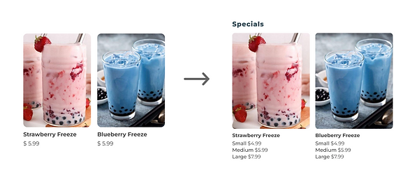
Updated product popup Ui card & Menu
-
4/4 of the users would have liked to see the actual sizes next to the 'small' 'medium' 'large' size options along with each of the specific prices for every size of the product immediately when browsing the menu
-
I enlarged the product popup so that it may accommodate the added features
-
I updated the rest of the selections to match the buttons for consistency
-
I added each of the prices for each size on the menu under the image of the product

desktop
desktop
Clarified the flow to customize order
-
2/4 users wanted a more clear way to be able to bring back the pop up that displays the options to customize the order when they are on the order summary page, they did not like the pencil icon
-
I changed the pencil icon to words 'Edit Order' on the UI card so there can be more clarity for users if they would like to customize their order once they are on the summary page

mobile
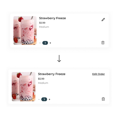
desktop
Updated Reviews
-
Users liked looking at the reviews section, however they wanted to be able to look at one review at a time and be able to control when they see the next customer's review
-
I made a larger section for the reviews written and the ability to click through them, however users then desired to see exactly how many reviews were left and how many they would be clicking through
-
I added numbers as a visual representation on the bottom of the review ui card to let users know exactly where they are in the process of reading the reviews

desktop
Color coded discounts
-
4/4 users felt like they would be more motivated or more likely to consider an offer when they know how much they will be saving right away, rather than reading into text that looks too similar as a whole
-
In order to save users time while browsing, I color coded the discount on the order summary page so that users can immediately know what their offer is without needing to read the entire text

desktop
reflection
How this redesign helped customers & the company
Customers
-
Created an inviting design with clear Call to Actions
-
Improved upon the site map, navigation and information organization
-
Improved upon content placement, white space and use of color & imagery
-
Created the process of browsing for products, customizing them and being able to order online
Company
Throughout the process my goal was to implement user centered design to enhance the website's usability and conversion rate. By conducting thorough user interviews and usability testing, I have identified key pain points in the customer flow and restructured the site map to streamline navigation.
An organized and responsive ui was introduced to improve accessibility and create a consistent experience on both mobile and desktop devices. Call to actions were optimized and the checkout process was simplified, reducing frustration and increasing user engagement.
Through usability testing and continuous iteration, the new design led to improved task completion rates, and an uplift in customer satisfaction. These UX enhancements contribute to higher conversion rates, ultimately helping the company boost revenue from the redesign.
What I learned 🌱
-
It is best to avoid investing too much time and effort into a design before receiving earlier feedback and conducting user testing. Designs should always be user centered and iterated based on user feedback, so frequent and early input can be very helpful in a design process.
-
There are plenty of businesses that users can order online from rather than attempting to navigate a disorganized site. A well structured navigation, site map and informational hierarchy with clear call to actions are all essential parts of a website that produce higher conversion rates and prevent customers from leaving the site due to it being too difficult to navigate, browse products and purchase from.
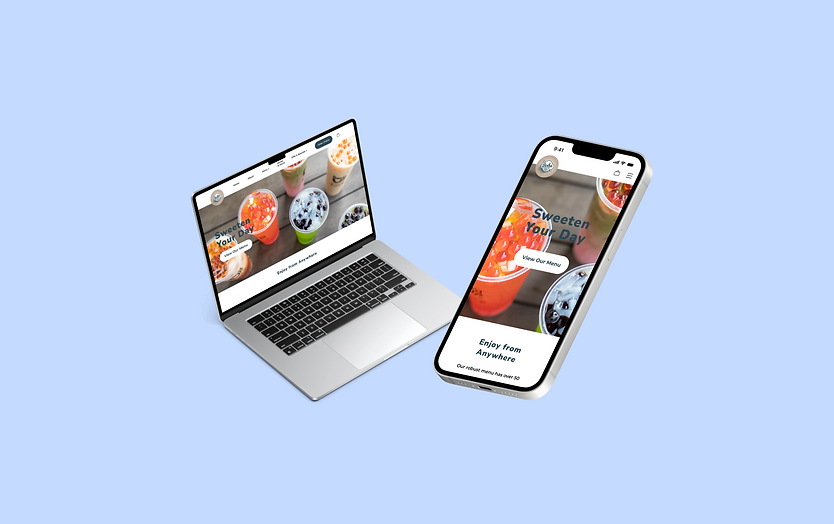
Final Design
bottom of page